Principles
In an app, never set a text size, never draw a shadow, never pick a blue. Use the text style, the system control, and the accent.
The tokens exist for the gaps macOS leaves (cards in a menu, the Settings width) and for this site, which has no system to lean on and imitates one.
Four layers
- Palette: 19 raw colours, named for what they are. Nothing uses them directly.
- Semantic tokens: named for what they are for, such as
text.primaryorspace.md. The only names a component may use; every colour has a light and a dark value. - Primitives: the few reusable pieces built from tokens, in CommonUI for the apps and
in
app.cssfor the site. - Pages and views compose primitives and take every value from a token.
What is the system's and what is ours
Where macOS has a colour, an app uses it, so the user's accent, Increase Contrast and appearance apply. The site has to imitate one.
| Token | In the apps | On the site |
|---|---|---|
text.primary | labelColor | #1d1d1f / #f5f5f7 |
text.secondary | secondaryLabelColor | #6e6e73 / #86868b |
text.inverse | white | #ffffff |
surface.base | windowBackgroundColor | #fbfbfd / #000000 |
surface.card | ours: #0000000c / #ffffff0c | #f2f2f5 / #1c1c1e |
surface.media | ours: #e4e4ea / #1c1c1e | #e4e4ea / #1c1c1e |
surface.chrome | ours: #fbfbfdcc / #000000b8 | #fbfbfdcc / #000000b8 |
surface.overlay | ours: #1e1e228c | #1e1e228c |
color.accent | controlAccentColor | #0066cc / #2997ff |
color.accent-fill | controlAccentColor | #0071e3 |
color.border | separatorColor | #00000014 / #ffffff1f |
color.border-card | ours: #0000000f / #ffffff0f | #0000000f / #ffffff0f |
color.focus | keyboardFocusIndicatorColor | #0066cc / #2997ff |
color.danger | systemRed | #d70015 / #ff453a |
color.warning | systemOrange | #c93400 / #ff9f0a |
color.success | systemGreen | #1e7a35 / #30d158 |
type.hero | none: site only | 80px / 1.05 |
type.display | none: site only | 56px / 1.07 |
type.title | .largeTitle text style | 40px / 1.1 |
type.title2 | .title text style | 28px / 1.14 |
type.title3 | .title2 text style | 24px / 1.33 |
type.headline | .headline text style | 21px / 1.19 |
type.body | .body text style | 17px / 1.47 |
type.callout | .callout text style | 15px / 1.47 |
type.footnote | .footnote text style | 14px / 1.43 |
type.caption | .caption text style | 13px / 1.38 |
type.caption2 | .caption2 text style | 11px / 1.36 |
font.* | none | --font-* |
weight.* | Tokens.Weight | --weight-* |
space.* | Tokens.Space | --space-* |
radius.* | Tokens.Radius | --radius-* |
motion.* | Tokens.Motion | --duration-*, --easing-* |
elevation.* | none | --shadow-* |
layer.* | none | --layer-* |
layout.* | Tokens.Layout | --layout-* |
Colour
Every semantic colour, as this site paints it in each appearance, with what the apps use
instead. Ratios are WCAG 2 contrast for each pair tokens.json lists; a test holds every
one to 4.5:1 in both appearances.
light #1d1d1f Aa 16.3:1 surface.baseAa 15.1:1 surface.carddark #f5f5f7 Aa 19.3:1 surface.baseAa 15.6:1 surface.cardtext.primary
Body text and headings.
- Apps
NSColor.labelColor- Code
Tokens.Text.primary·var(--text-primary)
light #6e6e73 Aa 4.9:1 surface.baseAa 4.5:1 surface.carddark #86868b Aa 5.8:1 surface.baseAa 4.7:1 surface.cardtext.secondary
Supporting text: ledes, captions, footers, table headers.
- Apps
NSColor.secondaryLabelColor- Code
Tokens.Text.secondary·var(--text-secondary)
light #ffffff Aa 4.7:1 color.accent-filldark #ffffff Aa 4.7:1 color.accent-filltext.inverse
Text on an accent fill or over media.
- Apps
NSColor.white- Code
Tokens.Text.inverse·var(--text-inverse)
light #fbfbfd Aa 16.3:1 text.primaryAa 4.9:1 text.secondaryAa 5.4:1 color.accentAa 5.2:1 color.dangerAa 5.1:1 color.warningAa 5.2:1 color.successdark #000000 Aa 19.3:1 text.primaryAa 5.8:1 text.secondaryAa 7.0:1 color.accentAa 6.2:1 color.dangerAa 10.2:1 color.warningAa 10.4:1 color.successsurface.base
The page and window background.
- Apps
NSColor.windowBackgroundColor- Code
Tokens.Surface.base·var(--surface-base)
light #f2f2f5 Aa 15.1:1 text.primaryAa 4.5:1 text.secondaryAa 5.0:1 color.accentAa 4.8:1 color.dangerAa 4.7:1 color.warningAa 4.8:1 color.successdark #1c1c1e Aa 15.6:1 text.primaryAa 4.7:1 text.secondaryAa 5.6:1 color.accentAa 5.0:1 color.dangerAa 8.3:1 color.warningAa 8.4:1 color.successsurface.card
A card or panel resting on the base surface. macOS has no card colour, so the apps tint the base with a little of the text colour.
- Apps
- ours,
#0000000c/#ffffff0c - Code
Tokens.Surface.card·var(--surface-card)
light #e4e4ea dark #1c1c1e surface.media
Behind a poster or video while it loads. Nothing is written on it.
- Apps
- ours,
#e4e4ea/#1c1c1e - Code
Tokens.Surface.media·var(--surface-media)- Contrast
- Nothing is written on it.
light #fbfbfdcc dark #000000b8 surface.chrome
Translucent bars that sit over content, blurred. In the apps this is a system material, not a colour.
- Apps
- ours,
#fbfbfdcc/#000000b8 - Code
Tokens.Surface.chrome·var(--surface-chrome)- Contrast
- Translucent, so its contrast depends on what lies under it.
light #1e1e228c dark #1e1e228c surface.overlay
A control floating over media, in either appearance.
- Apps
- ours,
#1e1e228c/#1e1e228c - Code
Tokens.Surface.overlay·var(--surface-overlay)- Contrast
- Translucent, so its contrast depends on what lies under it.
light #0066cc Aa 5.4:1 surface.baseAa 5.0:1 surface.carddark #2997ff Aa 7.0:1 surface.baseAa 5.6:1 surface.cardcolor.accent
Links, focus, and the active state. The user's accent colour on macOS.
- Apps
NSColor.controlAccentColor- Code
Tokens.Color.accent·var(--color-accent)
light #0071e3 Aa 4.7:1 text.inversedark #0071e3 Aa 4.7:1 text.inversecolor.accent-fill
A filled button. One blue in both appearances so text.inverse keeps its contrast; macOS draws its own buttons.
- Apps
NSColor.controlAccentColor- Code
Tokens.Color.accentFill·var(--color-accent-fill)
light #00000014 dark #ffffff1f color.border
Rules between sections and table rows.
- Apps
NSColor.separatorColor- Code
Tokens.Color.border·var(--color-border)- Contrast
- Translucent, so its contrast depends on what lies under it.
light #0000000f dark #ffffff0f color.border-card
The hairline around a card.
- Apps
- ours,
#0000000f/#ffffff0f - Code
Tokens.Color.borderCard·var(--color-border-card)- Contrast
- Translucent, so its contrast depends on what lies under it.
light #0066cc dark #2997ff color.focus
The keyboard focus ring.
- Apps
NSColor.keyboardFocusIndicatorColor- Code
Tokens.Color.focus·var(--color-focus)- Contrast
- Not used for text.
light #d70015 Aa 5.2:1 surface.baseAa 4.8:1 surface.carddark #ff453a Aa 6.2:1 surface.baseAa 5.0:1 surface.cardcolor.danger
An error, or a destructive action.
- Apps
NSColor.systemRed- Code
Tokens.Color.danger·var(--color-danger)
light #c93400 Aa 5.1:1 surface.baseAa 4.7:1 surface.carddark #ff9f0a Aa 10.2:1 surface.baseAa 8.3:1 surface.cardcolor.warning
Something that needs attention soon but is not yet wrong: memory pressure rising, a disk nearly full.
- Apps
NSColor.systemOrange- Code
Tokens.Color.warning·var(--color-warning)
light #1e7a35 Aa 5.2:1 surface.baseAa 4.8:1 surface.carddark #30d158 Aa 10.4:1 surface.baseAa 8.4:1 surface.cardcolor.success
Something that is going well: charging, allowed, done.
- Apps
NSColor.systemGreen- Code
Tokens.Color.success·var(--color-success)
Space, radius, motion and layout
Space
One scale for padding, margin, and gap, in points. There is no step between 4 and 8, and that is the point.
xxs 4xs 8sm 12md 16lg 24xl 32xxl 40xxxl 56section 72Radius
Radius, in points. xs is for small raised pieces such as a key cap; sm and up for cards and panels.
xs 4sm 8md 12lg 16full 9999Motion
Durations in milliseconds and easings. Both surfaces drop to zero when the user asks for reduced motion. The apps get there through Tokens.Motion.animation() and Tokens.Motion.duration(); here every duration becomes 0ms under prefers-reduced-motion.
fast 150ms base 250ms slow 400ms standard decelerate accelerate Durations on the standard easing; then each easing at the slow duration.
Layout
Widths in points. The settings window and the menu panel are the apps'; the rest is the site's. Widths are drawn to scale against the widest.
settings-width 460menu-panel-width 320content 980prose 680lede 600gutter 22gutter-narrow 16breakpoint-narrow 760Elevation and layers
The site's only. Windows, menus and popovers get the system's shadows and stack themselves, so the apps have neither.
--shadow-chrome--shadow-media--shadow-media-compact--shadow-iconLayers: base 0 · raised 1 · sticky 10 · overlay 100
Type
The site's scale, named after the macOS text styles it stands in for; tracking follows Inter's dynamic metrics, -0.0223 + 0.185 × e^(−0.1745 × size) em. The apps use the system text style itself, so Dynamic Type and the user's settings keep working; only the site sets sizes. In an app, write .font(.body), never a size.
Small, native utilities.
--type-hero · 80/84 ·
semibold
· display · site only
Small, native utilities.
--type-display · 56/60 ·
semibold
· display · site only
Small, native utilities.
--type-title · 40/44 ·
semibold
· display · apps: .largeTitle
Small, native utilities.
--type-title2 · 28/32 ·
semibold
· display · apps: .title
Small, native utilities.
--type-title3 · 24/32 ·
regular
· sans · apps: .title2
Small, native utilities.
--type-headline · 21/25 ·
semibold
· sans · apps: .headline
Small, native utilities.
--type-body · 17/25 ·
regular
· sans · apps: .body
Small, native utilities.
--type-callout · 15/22 ·
regular
· sans · apps: .callout
Small, native utilities.
--type-footnote · 14/20 ·
regular
· sans · apps: .footnote
Small, native utilities.
--type-caption · 13/18 ·
regular
· sans · apps: .caption
Small, native utilities.
--type-caption2 · 11/15 ·
semibold
· sans · apps: .caption2
Site primitives
The pieces in site/src/app.css, live, in each appearance. A page lays them out
and adds nothing but tokens.
Light
Common Keys Soon A.card with a .badge in its title. A .callout: nothing leaves your Mac.
What's new.
A section.ruled: a band of the page under a rule.
| Metric | Source |
|---|---|
| CPU | host_processor_info |
| Memory | host_statistics64 |
scripts/task check site kitDark
Common Keys Soon A.card with a .badge in its title. A .callout: nothing leaves your Mac.
What's new.
A section.ruled: a band of the page under a rule.
| Metric | Source |
|---|---|
| CPU | host_processor_info |
| Memory | host_statistics64 |
scripts/task check site kit<a class="button" href="…">Download for Mac</a>
<a class="link" href="…">Read the docs ›</a>
<a class="card" href="…">Common Keys <em class="badge">Soon</em></a>
<p class="callout">Nothing leaves your Mac.</p>
<section class="ruled"><h2>What's new.</h2>…</section>App primitives
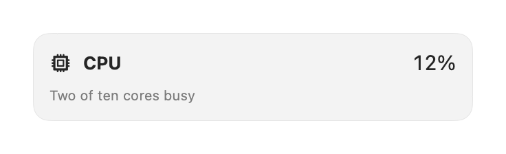
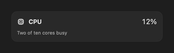
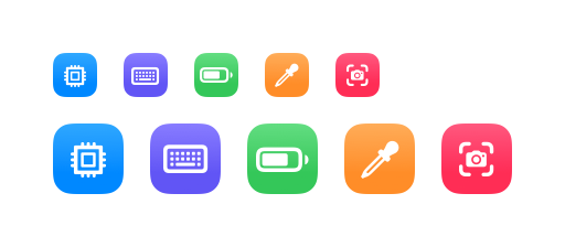
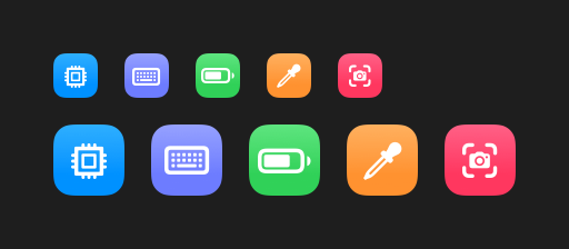
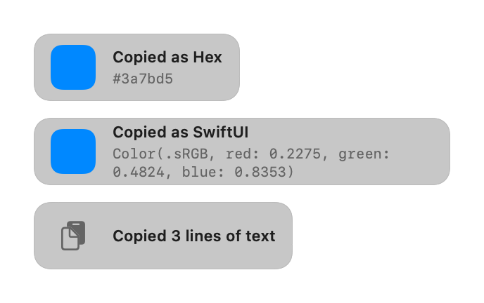
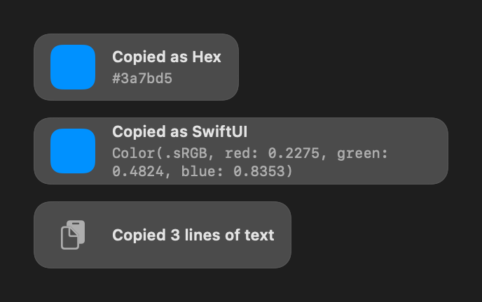
CommonUI's pieces as AppKit and SwiftUI draw them, offscreen, from the current sources. The apps build Settings from these; a contract test in every app holds it to that.
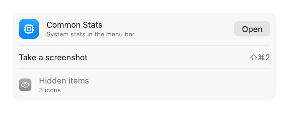
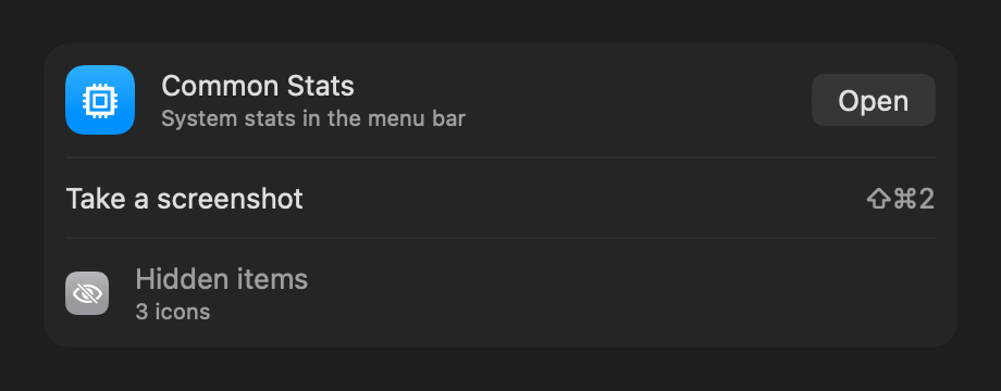
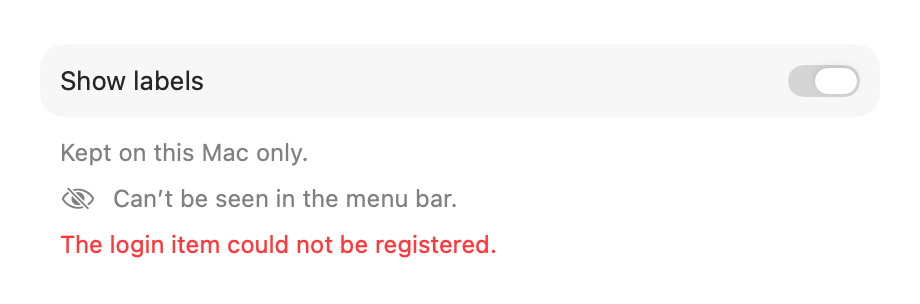
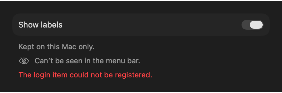
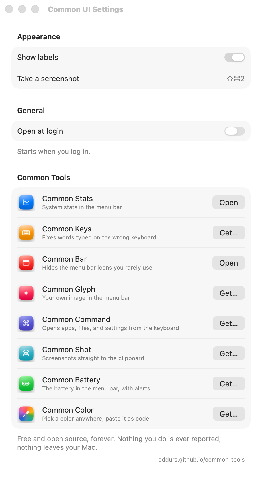
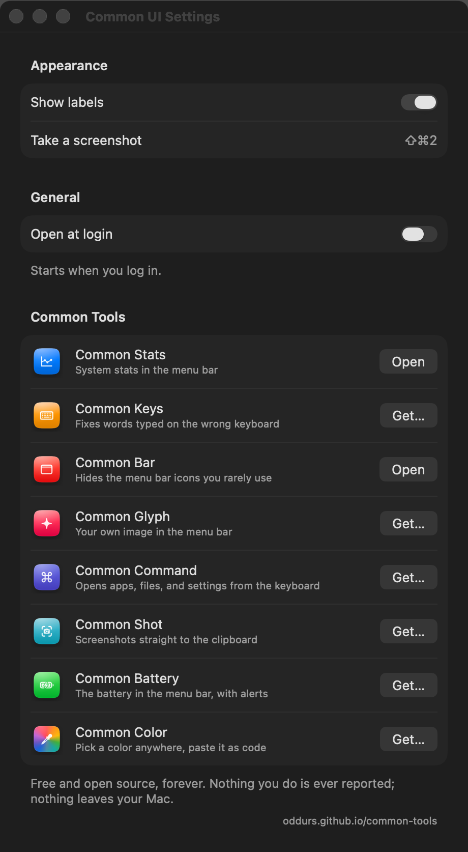
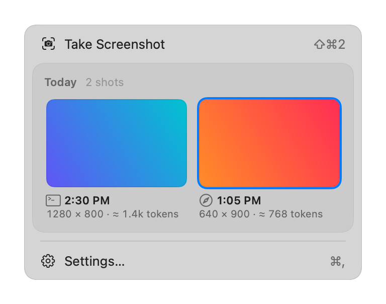
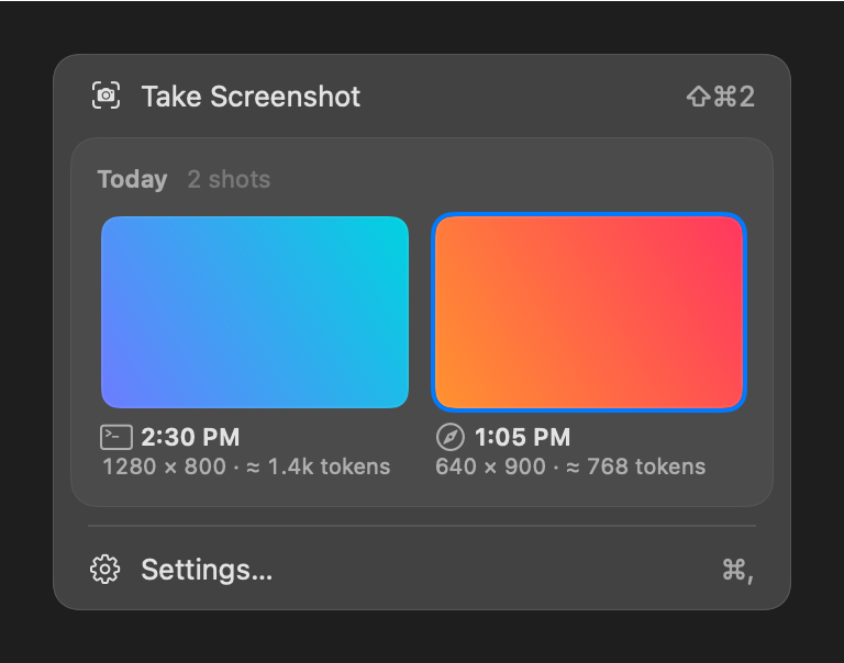
The apps
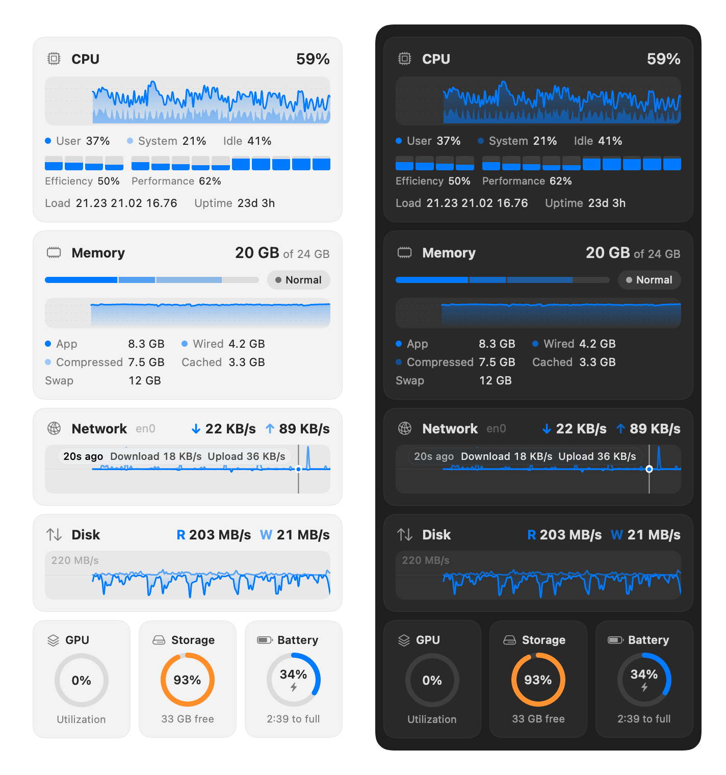
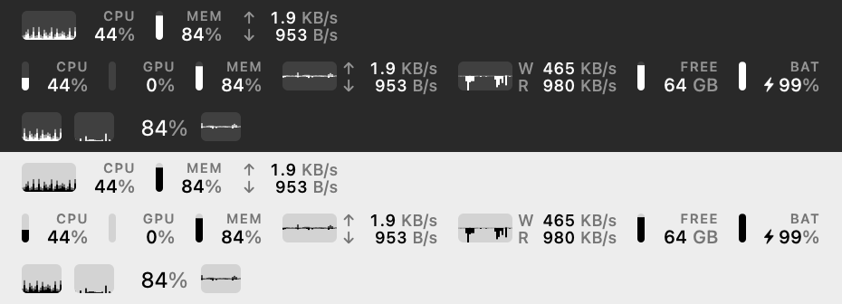
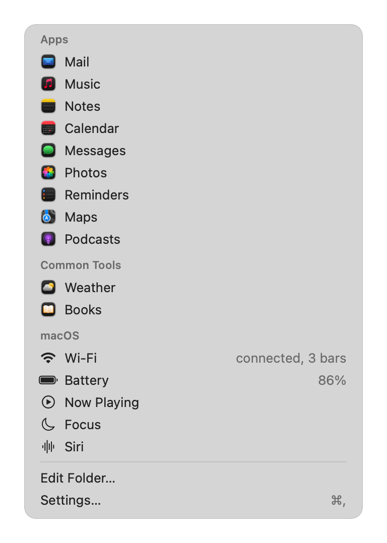
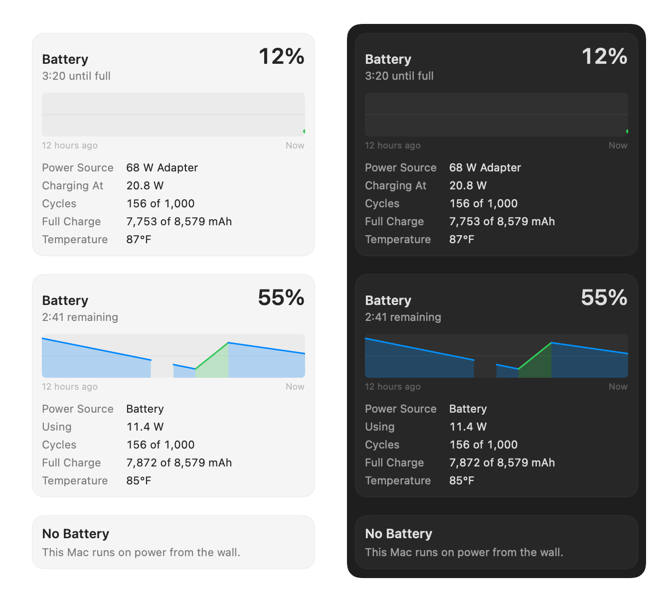
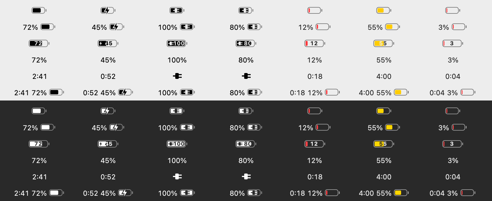
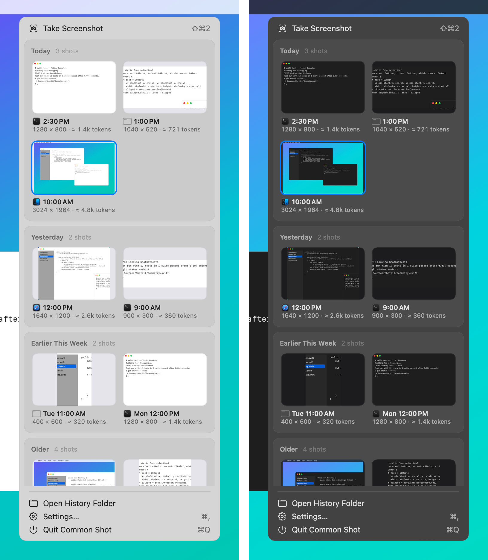
What each app draws with all this, from the images it keeps in apps/<slug>/docs/, light and dark side by side.
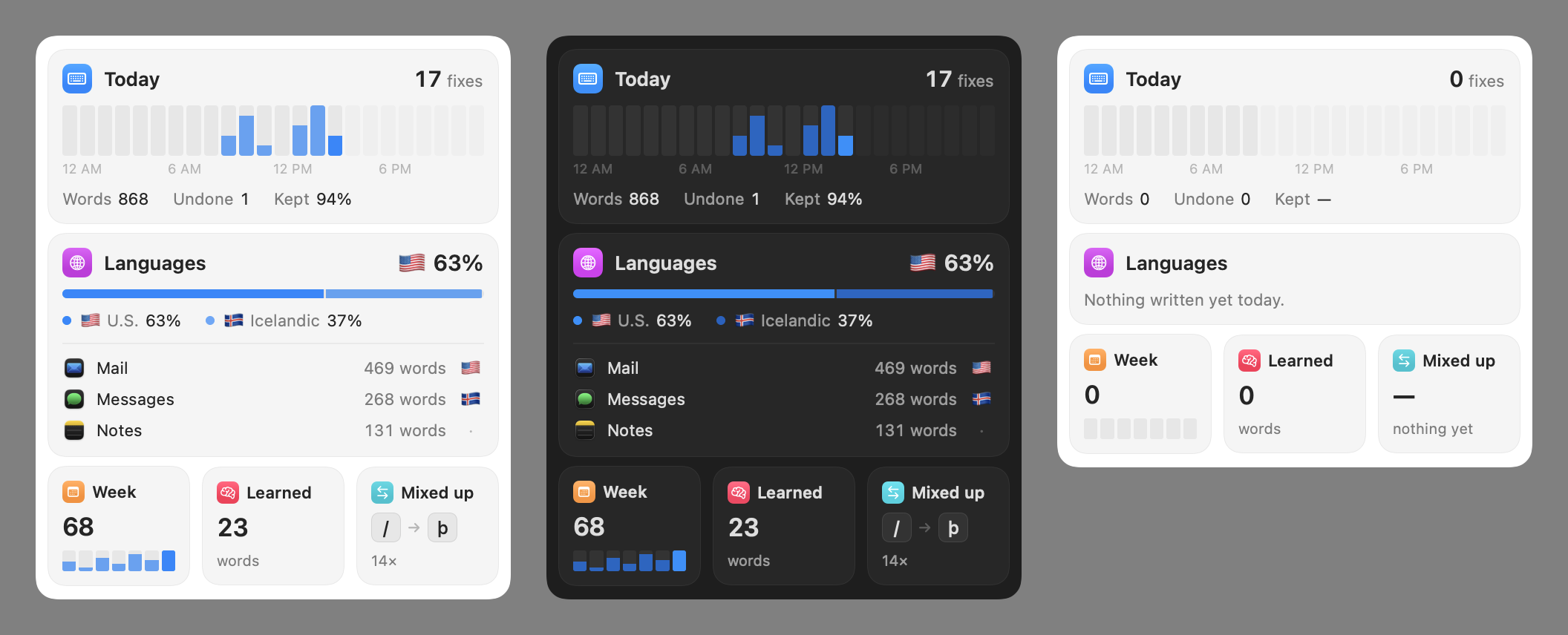
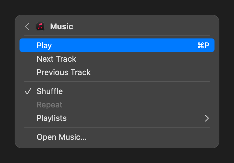
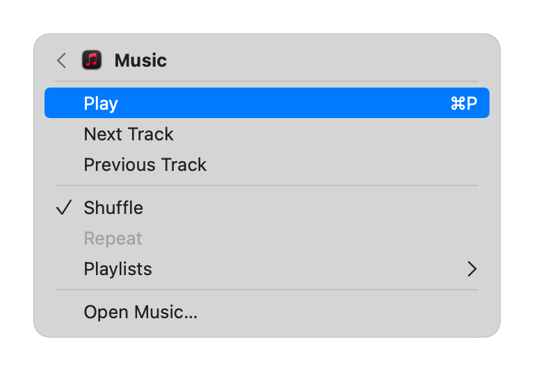
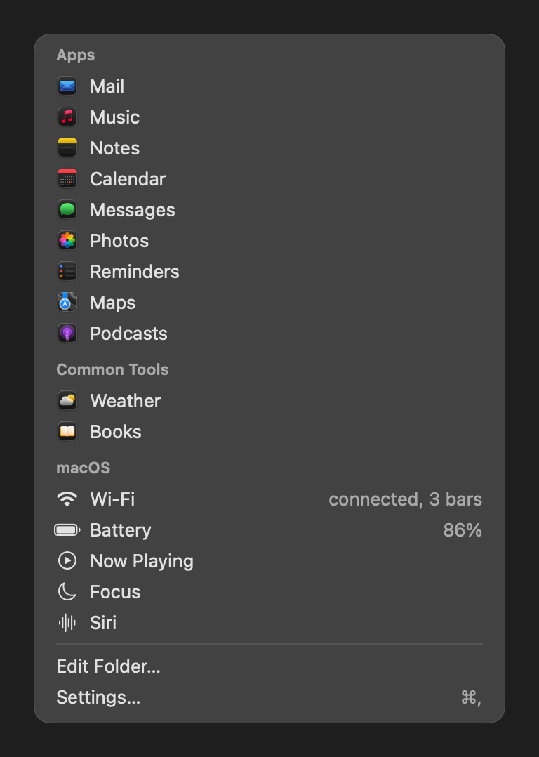
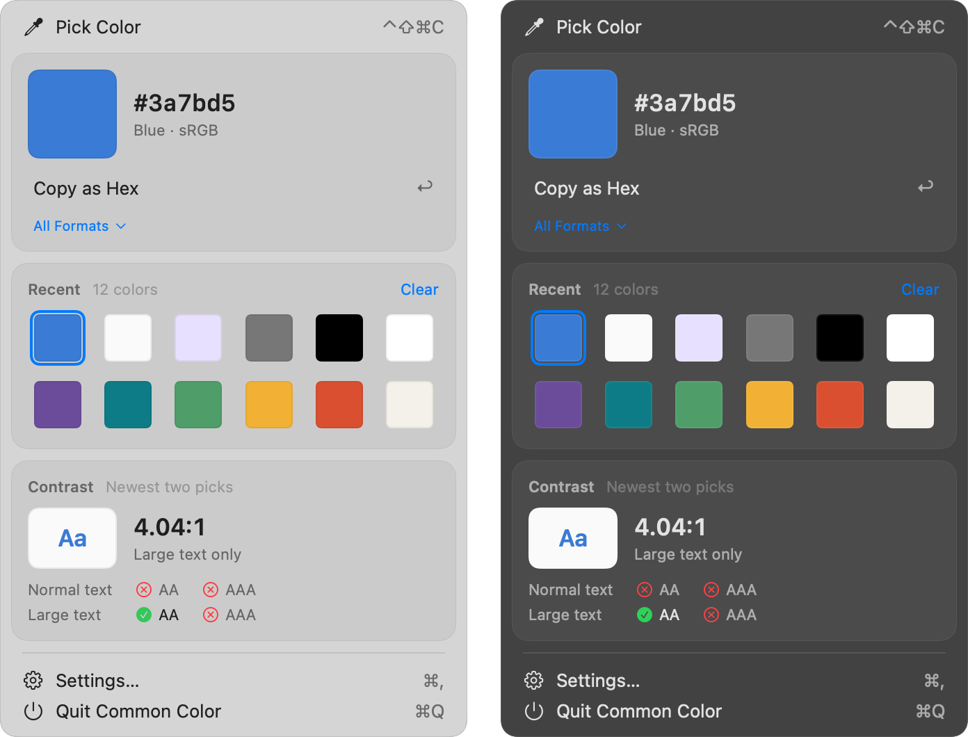
No app keeps an image of its Settings yet; the Settings window under App primitives is built from the same pieces. No docs images yet: Common Command, Common Glyph.